
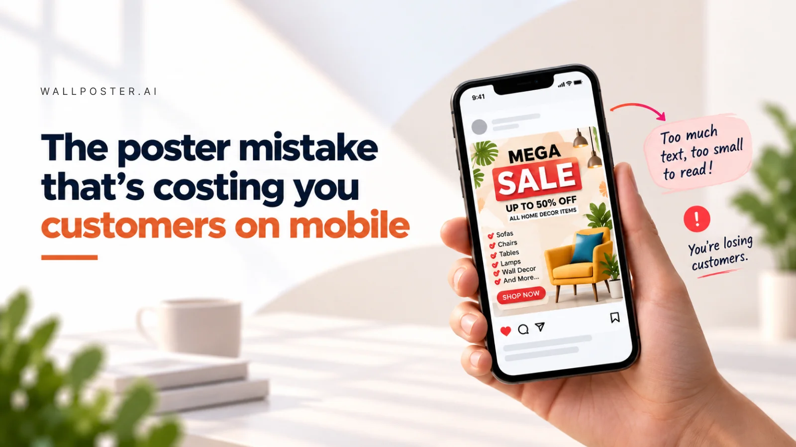
The poster mistake that's costing you customers on mobile

Here's a detail that quietly wrecks otherwise good marketing: designing for a screen nobody's using. Most customers see your posters on a phone, in a feed, scrolling at speed — not printed, not on a desktop monitor, not held still for careful reading.
A poster with small text, thin fonts, or a cluttered layout might look perfectly fine on your laptop while you're designing it. On a five-inch phone screen, scrolled past in under two seconds, that same design becomes unreadable noise.
The fix is to design mobile-first, not mobile-eventually. That means:
- Bigger, bolder text for the one thing you want noticed — usually the offer
- Fewer competing elements per design
- High contrast between text and background so nothing gets lost in a busy photo
Poster Maker's templates are built with this reality in mind, sized and structured for how content actually gets consumed today. Before publishing anything, it's worth the ten-second gut check: would this stop your own thumb mid-scroll? If not, it's not ready yet.
Common questions
Why does my poster look bad on mobile?
Most customers see posters on a phone, in a feed, scrolling at speed. Small text, thin fonts or a cluttered layout can look fine on the laptop where you designed it, but on a five-inch screen, scrolled past in under two seconds, the same design becomes unreadable noise.
How do I design a poster for mobile screens?
Design mobile-first, not mobile-eventually. Use bigger, bolder text for the one thing you want noticed, usually the offer. Keep fewer competing elements in each design, and use high contrast between text and background so nothing gets lost in a busy photo.
How can I check a poster before posting it?
Give it a ten-second gut check before publishing: would this poster stop your own thumb mid-scroll? If the answer is no, it is not ready yet. Poster Maker's templates are sized and structured with this in mind, for how content actually gets consumed on phones today.
Poster templates for this
Ready to make one yourself?
Turn any idea into a finished poster with Poster Maker.